A Grand Reveal: The Renovation of Springhill Medical Center Heart Center Lobby
Cardiology Associates (CA) provides adult and pediatric cardiovascular care in the Gulf Coast region and ranks among the top cardiology private practices in the nation. They have been a long-term tenant of Springhill Medical Center (SHMC) in Mobile, Alabama, with both their headquarters offices and doctors’ offices located on the 4th floor of the SHMC Heart Center.
Walcott Adams Verneuille (WAV) worked with both SHMC and CA to renovate the 1st and 2nd floors of the Heart Center to increase their footprint from 21,000 sf to 35,000 sf. This project included new clinical space, housing an imaging suite and new corporate offices for CA, a new Cardiac Rehabilitation space on the 1st floor for SHMC, and a renovation to the lobby and common spaces.
Due to the complexity involved in staging construction while both the hospital and CA maintained full operations, the project was completed in eight separate phases. WAV provided the architectural design and all the interior design including the selection of furniture, artwork signage, and large scale graphics.
CA wanted a warm, inviting and corporate presence for their patients, clients and staff. WAV set the tone for this look in the design of the 1st floor reception. Patients enter through frameless glass doors to be greeted at a reception area framed with rich wood paneling and elegant, tone on tone wall covering. Reception is anchored by a strong tile accent wall behind the sleek quartz desk. Signage enhances this focal point along with contemporary brass lighting and circular architectural trim detail on the ceiling. The palette and feel created here continue throughout the clinical and corporate spaces. WAV also designed the 28’ long live edge wood board room table to add a unique, organic element to the sophisticated design aesthetic in the corporate board room.
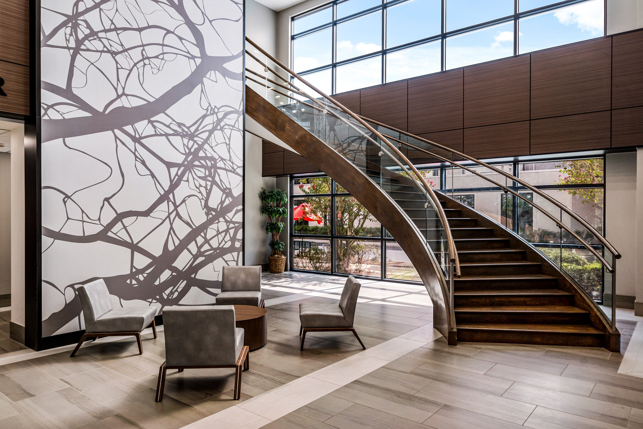
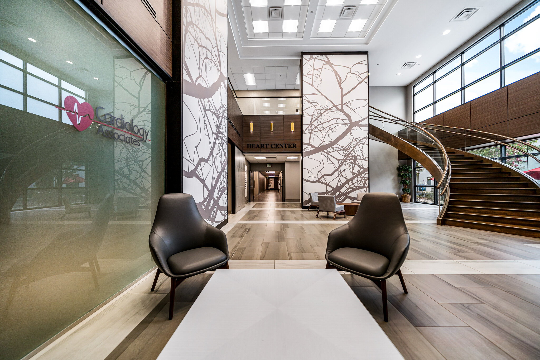
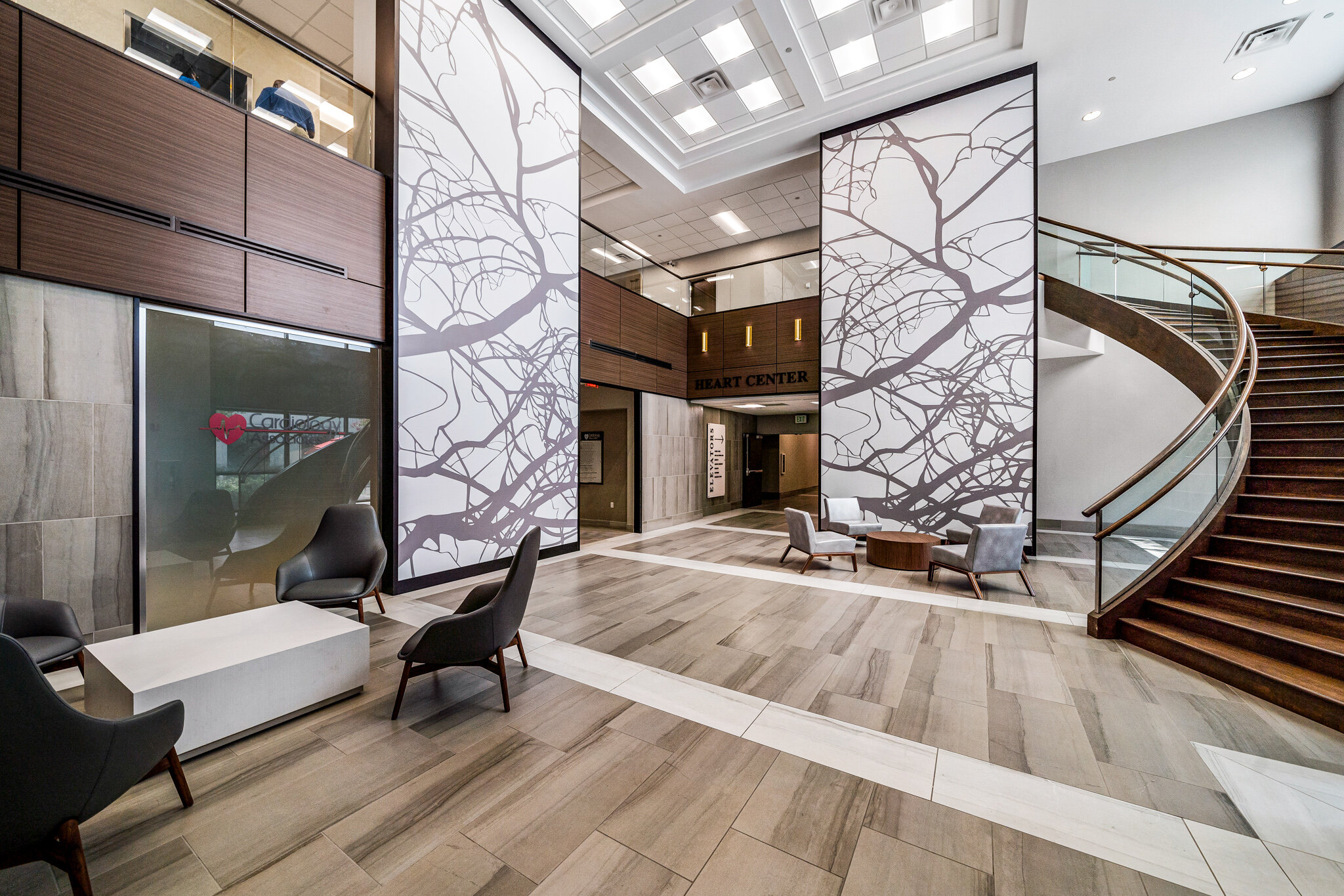
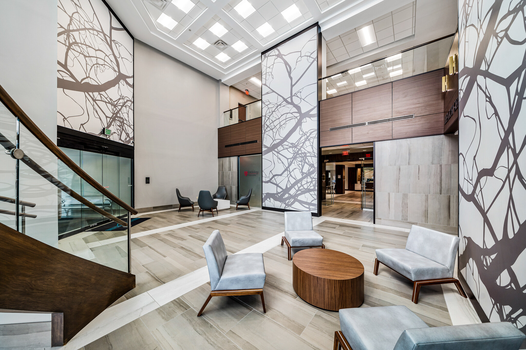
“We amplified the volume of the double height space to visually connect patients to the second floor. We achieved this with the design of several large scale graphics that draw the eye upward.”
Both CA and SHMC wanted the front door, lobby and common spaces of the Heart Center to look welcoming, polished, and unique, so WAV updated the building’s aesthetic and redesigned public space that hadn’t been touched in 20 years. Visitors are greeted with large scale vein murals that pull your eyes up to capture all the details of the two story lobby. Tile, glass railings and wood paneling accented with graphic signage and wayfinding create both the modern hospital and corporate lobby aesthetic. These details are dispersed throughout the public spaces to creating a consistent feel.
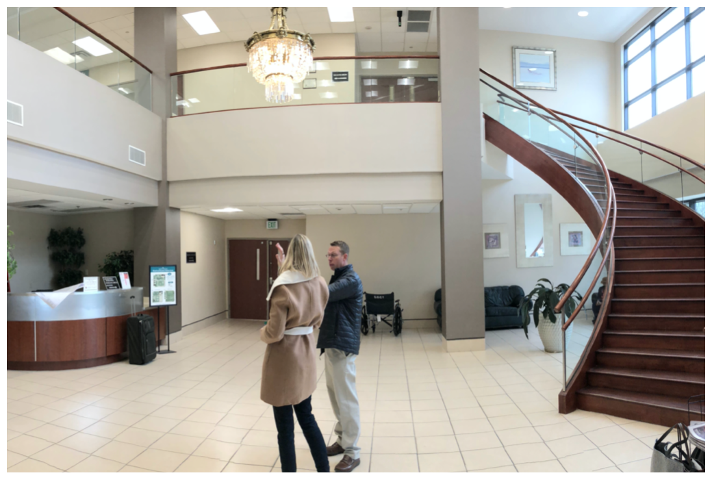
BEFORE images of the lobby entrance, reception area and grand staircase
BEFORE images of the lobby entrance (left) and view of lobby area (right)
BEFORE image of reception area and grand staircase in the lobby
The challenges we faced were not unusual for renovation work. We worked within the existing footprint and kept several major components such as the stair and ceiling intact. Some of the walls were not square or plumb, which could have presented problems with our double height graphics and wood panels, but we chose flexible systems and set the graphic walls out-face of the existing to achieve a plumb surface. There were structural columns to contend with, and the signage itself was a challenge because of the existing layout of the space—the signage was crucial in providing direction that wasn’t obvious from the layout itself. We considered this when placing the double height graphics and when designing the large scale, eye-catching signage leading patients to the corridors.
The design impacts families and patients by providing a welcoming waiting space and a first impression that the staff, families and patients can all be proud of and find comfort in. The serene, updated space is meant to instill confidence in patients and also hint at the innovation and exciting work that is taking place beyond the Lobby.


